
Did you know, as per the colourblindawareness.org and statistics worldwide, 8% of men and 0.5% of women have a red/green type of color vision deficiency? How many of us have thought about changing designs or colors for easy accessibility for such individuals?
In today’s visually-driven world, branding is crucial in capturing consumers’ attention and conveying the essence of a company’s product or service. However, amidst the pursuit of eye-catching designs, it is vital for brands to prioritize accessibility to ensure inclusivity for all individuals, including those with color blindness. This blog will explore the impact of color blindness on branding, delve into the significance of accessibility, and provide insights on how brands can make their visual identities more inclusive.
Understanding Color Blindness
Color blindness is a condition that affects millions of people worldwide, making it challenging to distinguish between certain colors or perceive them accurately. It is important to note that color blindness is not a complete inability to see colors but rather a deficiency in differentiating specific hues. The most common types of color blindness are red-green and blue-yellow deficiencies, which can significantly impact how individuals perceive brand visuals and messages.
Some important things to consider when we talk about color blindness. There are different types. The first one is Red-green color blindness. They are divided into 4 types – Deuteranomaly, Protanomaly, Protanopia, and Deuteranopia. Blue-yellow color blindness has 2 types – Tritanomaly and Tritanopia. The last category is Complete color blindness. If you want to test this, try out the Ishihara Chart – Color Blind Test. It detects red-green color blindness.
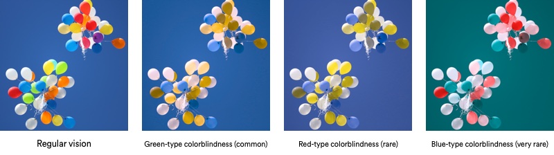
Image Source
Please check this for an easy understanding of accessibility tools.
What is the Importance of Accessibility in Branding?
There are 3 major things when you include accessibility in branding – Inclusivity, Enhanced User Experience, and Expanded Target Audience.
- Inclusivity – Prioritize your brand inclusivity and get recognized as a unique brand. The commitment helps to ensure that their messages are accessible to individuals with color vision deficiencies. By considering the needs of color-blind individuals, brands foster a sense of belonging and create a positive brand image.
- Enhanced User Experience – An accessible brand identity can improve the overall user experience. When color-blind individuals can easily navigate a website, read content, and understand visuals, it leads to a more satisfying interaction and encourages them to engage further with the brand.
- Expanded Target Audience – By making branding accessible to color-blind individuals, brands tap into a broader target audience. This inclusivity can result in increased customer engagement, brand loyalty, and, ultimately, business growth.
Useful Tips for Brands to create accessible branding
- Color Palette – Select an inclusive color palette for your brand. Brands should use color combinations that provide sufficient contrast and avoid relying solely on color to convey information. Tools like Color Safe and Contrast Checker can assist in evaluating color contrast ratios.
- Clear Typography – Use legible fonts and ensure a proper contrast between the text and background. Avoid relying solely on color variations to differentiate text elements.
- Icons and Images – Incorporate visual cues beyond color to convey information. Utilize labels, patterns, or shapes to assist understanding for color-blind individuals.
- User Testing – Conduct user testing with individuals who have color blindness to gain insights and feedback. This step helps identify potential issues and refine branding elements for optimal accessibility.
- Follow Monochrome Pattern – Include a single color and its hues to avoid confusion. Too many colors can lead to confusion for color-blind individuals.
- Mobile Accessibility – The number of mobile users has been increasing every single day. Do consider mobile accessibility for the ease of frequent mobile users.
Additionally, browse for unique tools are plugins to enhance the readability for color-blind individuals.
In an era where inclusivity and accessibility are essential, brands must recognize the significance of considering individuals with color vision deficiencies. By adopting accessible branding practices, brands demonstrate their commitment to inclusivity, enhance user experiences, and broaden their target audience. By embracing accessibility in branding, brands take a positive step toward creating a more inclusive and empathetic world.
Branding is a lot more than a logo. It is essential to change your perspective or add new value-added services for a good branding game. It can help you stand out from the crowd. Overall, it is essential to consider several new techniques or elements that include the colors, fonts, and design elements of the voice, values, and customer interactions for effective branding. Are you new to branding? Allow us to help you, call us for a free consultation today at +91 72492 22661