• Home
  • About Us
  • Services

    Video Production

    Graphic Design

    Website Development

    Branding

    Music Production

    Social Media Management

    E-learning Solutions

    Photography

    Digital Marketing

    Brand Analysis
  • Blogs
  • Case Studies
  • Home
  • About Us
  • Services

    Video Production

    Graphic Design

    Website Development

    Branding

    Music Production

    Social Media Management

    E-learning Solutions

    Photography

    Digital Marketing

    Brand Analysis
  • Blogs
  • Case Studies
Contact

Tag: logo

Blog-rebranding-feature-image

3 Crucial Rebranding Aspects for Best Results

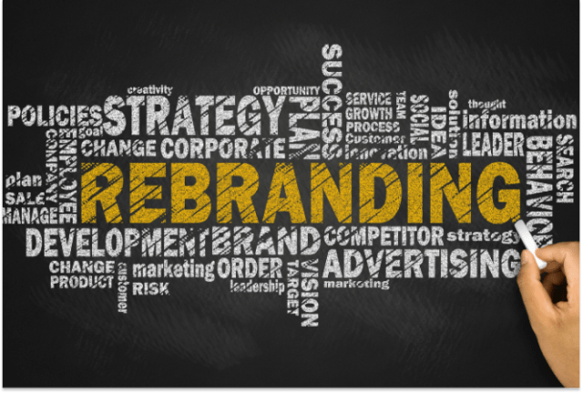
Rebranding is a trickier process than one might comprehend. Given that many popular brands have gone under the knife recently, we must understand the process to better gauge the reason behind the cosmetic or not-so-cosmetic changes. Rebranding helps you reinvent your brand, add a fresh perspective and even boost your brand awareness. Contact Antriksh to create a Brand Strategy for your business and Book a free consultation with our experts to help you attain business objectives.

In this article, we’ll walk you through significant rebranding stories in history and shed light on the crucial components of rebranding.

1. Diversification

The resurgence of Lego, which has surpassed Ferrari as the most powerful brand in the world, has been hailed as the most remarkable corporate turnaround in history. A book on the subject, Brick by Brick: How Lego Rewrote the Rules of Innovation by David Robertson, has become a standard business text. Boeing, Adidas, and Sony are rumored to have used it. Google now encourages employee innovation by providing Lego blocks. However, the journey toward being the most prominent brand wasn’t an easy one.

Lego had never experienced a loss since its establishment in 1932 until 1998. It was in serious trouble by 2003. Sales were down 30% year over year, and the company owed $800 million.

Lego was instructed to diversify, and as a result, it nearly went out of business. It brought forth jewelry for women. Lego-themed clothing existed. Theme parks that cost £125 million to build were built, and in the first year, they lost £25 million. Despite having no prior expertise in the industry, it created its own video game firm from scratch and the largest installation of Silicon Graphics supercomputers in northern Europe.

Blog-lego-brand-image

When a movie came out that year, Lego tie-in toys like their Star Wars and Harry Potter-themed kits were popular. Taking a cue from the affiliation with movies, Lego later produced films that were adored by both the public and the critics, and that is where the turnaround began. Lego movies were the catalyst that the brand needed to accelerate its growth.

Due to its expansion and current prominence, the company has even been referred to as the “Apple of Toys.” Thus, it is imperative to note that rebranding doesn’t necessarily mean making aesthetic changes to your brand. Rebranding can also be associated with a difference in the model of business operations.

2. Sometimes, doing nothing is the best thing to do

Since Gap had been using the same logo for longer than most graphic designers had existed, the choice to try something different was at least sensible. What we find puzzling is their desire to switch out their recognizable stretchy serifs for Helvetica and a tiny gradient box that can win over no one. They ultimately lost $100 million as a result of it.

Gap chose to revamp its 20-year-old logo in 2010, citing weak sales following the Financial Crisis of 2008, which gave rise to the “Gapgate” scandal.

Blog-gap-brand-image

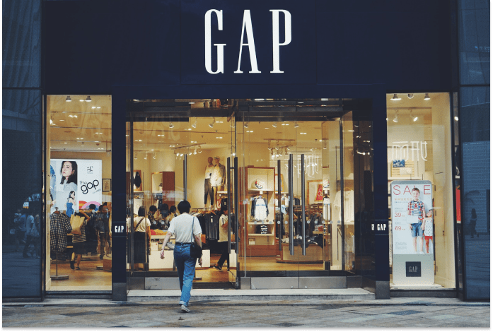
Along with modernizing and revitalizing the business, Gap appeared to be on a mission to boost sales and stock values. It has been said that this desire to modernize stemmed from a “panic to act quickly” to boost declining sales.

The reaction to their unexpected release of this new logo was so adverse that, after just one week, they were forced to switch back to the previous.

When a person thinks of or hears a brand name, the logo is frequently the first thing that comes to mind. Consumers use logos as a vital signifier of a brand. Therefore, a critical factor in increasing brand salience is the logo. Any brand awareness that has been established could be lost if your logo is changed at the drop of a hat.

Lesson learned: If your current aesthetic is compelling, a rebranding should build upon it or give it a fresh perspective rather than making it bland.

Blog-rebranding-trend-image

3. Trending isn’t the reason for Rebranding

If your motivation for rebranding is keeping up with the trend, then that’s the wrong way to go about it.

The oil corporation British Petroleum chose to alter its logo in 2000 after using the same one for 70 years. Creating the new logo is thought to have cost BP $211 million.

British Petroleum is a prime example of poor branding for several reasons, including the astronomical sum of money spent on rebranding. The only thing that remains the same between the new and old logos is the color scheme.

Moreover, British Petroleum decided to make the image of Helios, the Greek sun god, the primary component of their new logo. The corporation intended to portray a renewed commitment to green growth with this move.

However, BP is anything but eco-friendly. To refresh your memory, they were in charge of the most significant marine oil leak in history in 2010!

The goal of a successful rebranding and new logo should always be to convey the organization’s mission and goals.

As a Brand Agency, we at Antriksh understand that rebranding should rejuvenate a brand and add to its value. With our thorough brand analysis, we develop tailored solutions for your business. Click here to explore the endless possibilities to boost your business.

logo-blog-feature-image

4 useful tips for the best logo design (FREE tool reveals inside!)

What comes to your mind when I say, Nike? Are you visualizing a lone swoosh mark? 

Well, that’s the essence of a successful logo to make you quickly recall it. 

Besides, recognizing a powerful logo makes customers feel more optimistic about any brand. That means tapping into viewers’ minds and giving them a reason to remember can get your brand more eyeballs.

Here are the top no-brainer reasons why you need a solid logo design for your business-

  • It grabs attention
  • Fosters your brand loyalty
  • It makes your business stand out from the competition. 

While designing a logo it is crucial for your brand, to build a winning strategy and that can be challenging. It demands deep research, creativity, and an understanding of what works.

You can spend days and weeks coming up with a good logo. But if you are eager to learn the nitty-gritty of logo designing and design your brand’s logo, this blog will offer a deep dive into the concept.

Designing a good logo

Designing a logo means creating the best visual brand mark for your company. A decent logo is distinctive, practical, and simple in form. Let’s break down what makes a good logo for your brand-

  • Unique design– Choose a design that displays your brand’s style and personality. You need a logo that doesn’t blend in with the crowd, leaving a lasting impression in people’s minds.
  • Logo color– Color is the perfect trigger for your target audience. Ask yourself how the color palette and fonts will match your brand story.
  • Readability– Your logo has a few seconds to make it memorable. Make sure your logo design is simple and practically looks appealing on your website, social media channels, or the Metaverse. 

According to stats, it takes 400 milliseconds for the brain to form an opinion about your logo. That’s why simplicity in your logo design is non-negotiable to make it responsive. You can read more about how your brain processes logos here.

design-thinking-quote

Impactful Logo designs

Now, let’s look at the most impactful types of logo design for your business-

  • Abstract logos-

An abstract logo is a type of pictorial logo that uses graphics to convey the core messaging of your brand. It works best in a highly competitive market when you want to stand out. Famous brands using this design strategy are:

ABSTRACT LOGOS

  • Combination logos- 

You don’t need to limit yourself to a specific style when it comes to a logo design for your brand. A combination style is quite popular in logo design, clubbing text and icons in a single logo. Big brands using combination logos are: 

COMBINATION LOGOS


  • In motion logos- 

In motion, logos are moving designs allowing the companies to maximize the clarity and memorability of their branding. It lets the audience take in the details of the design, and works best for virtual platforms. For instance:

IN MOTION LOGOS

in-motion-logos

  • Monogram logos (or letter marks)

 Monogram logos consist of letters, usually brand initials for the identification purposes of your brand. For instance, how much easier it is to say and recall IBM versus International Business Machines. Other examples are:

-NASA

-Gucci

-H&M

  • Wordmark logos-

Wordmark logos focus on your brand’s name alone. Your business name should be catchy and clubbed with solid typography to make your brand logo memorable. If you are a new business, this type of logo is for you to get your name out there. Popular examples include:

-Google

-Cadbury

-Volvo

  • Pictorial logos-

Pictorial logos are graphic-based logos that contains only an image. It can be a tricky logo type for new companies because it demands strong brand recognition. A few famous examples are:

-Apple

-Twitter

-Starbucks

Here’s how you can optimize pictorial logos in different ways:

  • By using an illustrated character
    • Mascot logo – Mascot logos consist of colorful cartoonish characters. You can use this logo type to create your very own spokescharacter. Your brand can provide an amazing user experience, especially for young children and families. Popular examples are:

-Mickey Mouse | The Walt Disney Company

-Julio Pringles | Pringles

-Colonel Sanders | KFC

  • By enticing a classic old-school vibe to your brand
    • Emblem logos – Emblem logos give your business a classic or vintage look. This type of logo design is detail-oriented, less versatile, and for large-scale companies. A few examples of Emblem logos are: 

-NFL

-Warner Brothers

-Manchester United

Color Psychology

Well, colors have been proven to raise emotional triggers in buying decisions of viewers. So next, you should focus on understanding color psychology with three pro tips given below-

Bright colors reflect energy, happiness, and passion. On the flip side, black and white elicit sophistication and maturity. All you need to do is understand the right colors for your brand. Here we bring a list of different logo colors so you can design the perfect color palette for your brand:

  • Yellow logos – You can pick this color to exude happiness, youthful energy, and affordable pricing. But beware it doesn’t align with mature and luxury brands.
  • Red logos – If your brand stands for passion, intensity, and aggression, then red is your go-to color.  According to color psychology, red logos are bold and can make a statement for your brand. 
  • Green logos – If your brand comes under the health and financial sector, then think green. But, this color goes well with any brand because it is linked with strong cultural associations, harmony, and calming effect. 
  • Blue logos – Do you know Blue is the most used color in brands? It is also a universal color that exudes trust and calmness. It is used by all kinds of brands including finance, education, sports, etc.
  • Purple logos – If you want to come out as the alpha luxury brand, then Purple can fulfill your goal to stand out among the competition. Many designers also consider it the color of the future, portraying mystery, art, and change.
  • Black logos – If you want your brand to look modern, chic, and sophisticated, then go for black. Psychologically, this color creates seriousness while exuding authority and durability. 
  • White logos – White-colored logos will help your brand to create a perception of purity among the audience. Your brand logo will have a positive connotation creating an aura of cleanliness to communicate goodness and equality. 

Brand Personality 

So, create a color palette according to your brand personality.

Also, MIT researchers have found that the psychology of color isn’t universal. So keep the cultural context in mind.

Then, run color tests with your audience to figure out what works best for your brand and then be consistent with it. A few tools you can use to put your logo to the test are mentioned below-

  1. Check my colors:

It is an easy-to-use web-based tool to: check the background and foreground colors of your website. It provided you with a tabular report regarding all the elements. 

  1. Logo Lab: 

This free tool rates your logo on 10 key factors like recognizability, scalability, balance, etc  It lets you see the logo as an app icon and also summarizes whether your logo design is perfect or it needs some changes. 

  1. Color Shark:

If you are looking for a tool to foresee color contrast accessibility and test your design, Color Shark is best in the picture. If your brand colors don’t feel right, it automatically finds the closest accessible colors. 

Other than tools, you can go for the organic logo color testing method and which is simply to ask your audience. All you have to do is select 3 brand colors and ask the viewers to vote for their favorite color. 

So, this is how you can make logo design work well for your brand. And, if you need assistance with logo designing or complete branding consultancy, visit Antriksh’s Website to book a free consultation.

Explore ideas with us

Drop us a line!

contact@antrikshglobal.com

Whatsapp us
Contact us

Quick links

  • About us
  • Services
  • Case studies
  • Blogs
  • Contact us
  • Privacy policy

Services

  • Graphic Designing
  • Video Production
  • Website Development
  • Digital Marketing
  • Social Media Management
  • More...

Contact

  • +91 7249-222-661
  • 2nd floor, Gayatri House, Pan Card Club Road, Near Paranjpe Saptagiri Society, Baner, Pune - 411045

Follow us on socials

Facebook Pinterest Youtube Linkedin

Google reviews

© All rights reserved | Designed & Developed by Antriksh.

We use cookies to ensure that we give you the best experience on our website. If you continue to use this site we will assume that you are happy with it.OkPrivacy policy